For my communicate brief, I am going to rebrand playing cards, creating a logo and a new style that is suited more towards drinking games than traditional card games.
I will research existing card designs and see what is successful.
I will also create my own suits for the cards as during my research brief I was told that most people dislike the current suits as they feel dated and boring, especially to students who are most likely to play drinking games.
Thursday, 23 January 2014


Wednesday, 22 January 2014


Playing card research
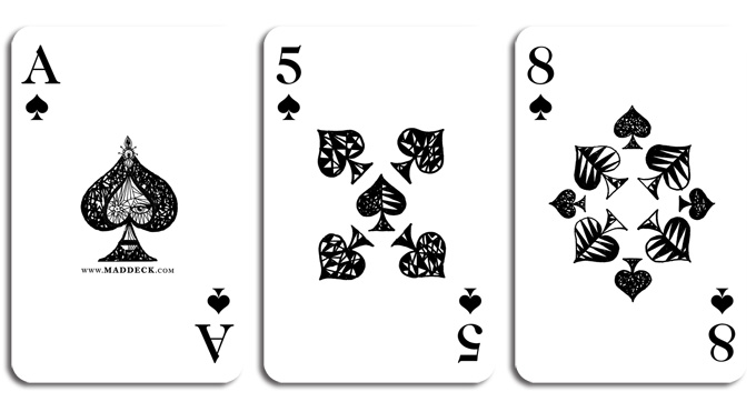
'Mad Deck' by Özlem Ölçer is a set of playing cards with beautiful illustrations. staying away from the standard layout, these border on abstract, but remain extremely easy to use. The use of colour and tone, on the paint cards especially, give the designs much more depth whilst keeping each suit clear.


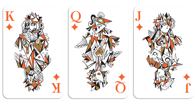
 Kikkerland Design created some brilliant transparent playing cards, which are fully waterproof- which would be ideal if I were to create cards which will be around many drinks. The large imagery make it easy to see which would also be ideal since people using the cards would often be drunk. This would mean however, I wouldn't make my cards transparent at all.


ASDA had a wide range of photo frames, however none of them were successful. Some caught my eye, but then lost my attention almost immediately because I felt that the frame was already belonging to somebody else. The images that caught and retained my attention drew it away from the frame itself. All of the other frames didn't catch my attention at all.
research on photo frames

Looking at existing photo frames, I realised that most of the placeholder photos were either black and white photos, portrait photos or a single colour with type. i felt that the photographic ones made the frame look already owned which i disliked. I think that the more plain, single colour ones worked better, however the type was often gimmicky, too fancy or dull. I think that the type used should match the photo frame aswell as the brand.
Monday, 13 January 2014


Subscribe to:
Comments (Atom)