Friday, 4 December 2015
COP DISSERTATION PRACTICAL
My practical must have a strong synthesis with my dissertation, so it makes sense that whatever I produce is a commentary on modernism/postmodernism through editorial design.
I have come up with a concept where I will produce an art installation that crosses the boundaries of editorial design and art. It will also be linked to my 'living organism' analogy which I have threaded through my dissertation. I will first create a publication using typical modernist design techniques and styles, which I would then deconstruct in some way, possibly by ripping apart each individual element (block of text, image, citations, illustrations etc) and suspending them with string/cable/paper (different materials based on what the content itself is and where it has been sourced from) - the concept being that they are suspended in both time and space but by a flexible means.
It will explore how far a publication can be deconstructed before it no longer becomes editorial design and ventures into fine art. The contents of the installation will be comprised of body copy (my dissertation) in grids, photographs, illustrations, my bibliography and research.
This is in reaction to emigre articles in which Rudy VanderLans claims that anything print that is seemingly new, is merely a variation of older works. However Tibor Kalman, creative director of Colors magazine claimed that ''People haven't started fucking with the printed page in a serious way yet...''. This is what I aim to do. Instead of the deonstruction coming from within the page, the pages and publication itself is deconstructed, exploded similar to Cornelia Parkers exploded shed.

The type itself would be created in a multitude of different ways. Some would be delicate (if the writing itself is somewhat delicate), so it could be handwritten onto tracing paper. Any work which is particularly complex and ornamental would be printed onto a patterned fabric. Whilst elements of my dissertation which I believe to be core to my argument would serve as the living organisms 'spine', which could be laser-cut into wood, perspex or possibly slab.
Where could I construct this? originally I wanted the piece to fill an entire room to showcase the scale of the complexity postmodernism holds, and also to emphasize how some links between arguments are strong and some far fetched. I want everything in the installation to have a purpose and concept, never considering the aesthetic as that consideration would be put into the construction of the original publication.
As for the web, I could construct a web using strings in a similar way to Gabriel Dawe.

Yasuaki Onishi also produces suspended works using strings, however his strings are used to hang a material, closer to what I am wanting to accomplish.
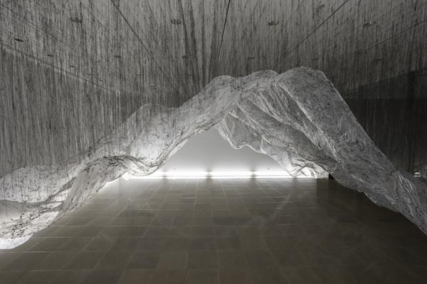
After consulting with tutors and other students, I have realised that given current timeframes and restrictions regarding possible locations for this installation, I have decided to refine the idea, and instead create an art sculpture/editorial design piece.
Postmodernism from what I can assert from my research is an incredulity towards meta-narratives, involving the blurring of boundaries between high and low culture, as well as types of craft. I will be creating a work which is composed of 2 frames attached by hinges, reimagining the 'book' concept. It will stand at about a meter high, with the intention that the audience will have to physically move around the object in order to understand the information better.
DISSERTATION CONTENT
“Simplifying
to the extreme, I define Postmodernism as an incredulity towards
metanarratives.”
-Jean-Francois
Lyotard
The postmodern philosophy is almost
impossible to define. Simon Malpas addresses this paradoxical issue in his book
‘The postmodern (the new critical idiom)’, where he says that finding a ‘simple
and uncontroversial’ definition for the term ‘postmodern’ is impossible, given
that the clear and concise process of identification required for such a label
is in fact one of the key elements of rationality which postmodernism attempts
to challenge.
One
of the first philosophers to explore postmodernism to it’s full potential was
Friedrich Nietzsche. Nietzsche disagreed with Kant’s theory of transcendental
categories, and instead suggested that truth is nothing but an illusion.
Stitzel (2005) concurs with this sentiment, saying that ‘’postmodern philosophy
encompasses that all ‘truth’ is relative to the individual, that it is, essentially,
whatever you make.’’
The
international avant-garde movement of Dada was a precursor to postmodernism.
With it’s anti-art concept it didn’t care for aesthetic, and intended to offend
and question the existing sensibilities of the art world. Suddenly art wasn’t
merely an end in itself, but instead as Hugo Ball put it, it became
instead ‘’an opportunity for the true perception
and criticism of the times we live in."
Postmodernism
blurs the lines between high and low culture. It believes that societal and
cultural hierarchies are false and unstable. With modern mass communication and
the vast amount of different subcultures and styles, it realises the ease in
which people can move fleetingly between different cultural experiences. It has
also been argued that the postmodern condition is grown from the economic shift
towards an international merging of culture and cultural goods.
Charles
Jencks, a notable architectural theorist, says of postmodernism that it is
fundamentally the eclectic mixture of any tradition with that of its immediate
past: it is both the continuation of modernism and it’s transcendance. Jencks
sorted postmodern attributes into Straight Revivalism, the idea of the creation
of something new which seems old, using nostaligia to communicate, and Radical
Eclectism, which mixes up styles and references in an ironic way.
Postmodernism
uses bricolage, parody, pastiche and appropriation extensively, referencing
past movements, events, designs, often satirically.
The
McCoys teachings emphasized the building of meaning between the graphic design
and it’s audience, forming a dialogue with the audience rather than a
monologue, believing that it was a ‘truer’ form of communication.
‘’The constitutive rules
that govern a particular kind of craft activity are not external to it. These
rules are the activity: they give it its own internal logic, which the
practitioner must follow, and, taken together, they add up to a body of
knowledge. To divorce them from the activity would be to destroy it.’’
(Poyner.R, 2003, p16)
The
lack of rules associated with postmodernism is massively problematic in the
sense that without governing rules, a standard of quality is impossible to
establish to review the works against. This provoked an influx of poor design created
by designers unfamiliar with design theory, under the guise of it being
postmodern.
Although
a target market is by definition more refined, the postmodern view of every
individual having their own viewpoint must be abandoned as the content could not
be tailored unless the magazine had a ‘prosumer’ marketing strategy, as many
online platforms now are starting to do.
John
Lewis in his book ‘Typography Basic Principles’ (1963) during a chapter named
‘Rules are made to be broken’, explains that before you begin breaking
established rules, you should first learn what they are, that there are in fact
meta-rules to breaking the rules.
The most notable accomplishment
of postmodernism was it’s critical questioning of existing themes and the
modernist styles which has stagnated and become overused due to a lack of
credible contest from other movements. The design landscape had atrophied after
existing for so long without this critical reexamining, until postmodernism
began exercising and reinvigorating it with fresh ideas about what the consumer
was both capable of, and what their role in the process was, turning from
spectator to participant. This exercising stretched and tore at design world,
and over time through refinement it healed to be stronger than before.
The postmodern philosophy then
rejected the idea of the metanarrative, believing that communicating is
accomplished more successfully by allowing typography and imagery to be as
expressive as the content itself. It also allowed for decoration and
ornamentation, pushing the boundaries between what can be considered graphic
design and fine art. It also attacked other boundaries such as the one which
divides high and low culture, in an attempt of unification, generating
plurality in design.
Instead of a creative
landscape, what exists can be considered a creative living organism.
Postmodernism acts as a parasite, necessary to the ‘survival of the fittest’
evolutionary process. It both attacks the organism, but also couldn’t exist
without it. What the current mainstream design beliefs were, which at the time
was modernist, act as an immune system, which either attempts to neutralize the
threat or to assimilate it. As the immune system became stagnant and
vulnerable, the postmodern parasite attacks, although unnoticed and undefended
against until it became widespread enough that it was damaging to it.
Eventually, the mainstream adopted certain strong elements of postmodernism,
the ones which were commercially viable, and killed off the traits which were
too outlandish and subjective to be used. The postmodern traits which survived
and were absorbed by the living organism gave work a human warmth element which
consumers enjoy and were thus commercially successful to corporations.
By 1977, Punk Rock was a hugely
influential movement which influenced culture and design massively for the next
few decades. The anarchic attitude echoed the feelings of past Dada artists,
longing for the tearing up of rules and the creation of new thought provoking
works.
he
incendiary pages of Ray Gun magazine inflamed the eyes and minds of
countless young designers who sought to tap into the freedoms unlocked by his
bold new style.
(Lupton.E,
2014. Aiga.org)
“Typography
conveys meaning. The kinds of letters that you use say something about what
you’re trying to project. They can portray hipness, they can portray authority,
they can convey playfulness, they can convey power.” – David Carson
From 1981 up
until 1986, Neville Brody was appointed Typographer, Graphic Designer and Art
Director of the magazine. His work was revolutionary, clearly channeling his
interest in Dada, futurism and constructivism into his designs. His use of
typography was groundbreaking and had a similar effect as Carson’s work at
Raygun, forming an esoteric aura around the magazine exclusively for the
fashionable youth.
MODERNISM
The agenda of Modernism was to create design that improved the
world through work which projected the ideas of fairness and equality. After
world war 2, ‘utopian fever’ gripped the world inspiring designers worldwide to
attempt to create works which transcended personal tastes, communicating to
everyone, unifying the audience.
The
sans-serif typeface Helvetica, designed by Max Miedinger in 1957, is a perfect
example of modernist principles. Infamous for its absence of connotations, it
is completely void of style or flourishes, designed using a simple geometric
grid, and was at it’s conception completely neutral. This ‘non-style’ however
became style in and of itself after mass usage by corporate advertisers and
branding.
“Perfection is achieved,
not when there is nothing left to add, but when there is nothing left to
remove.”
Joseph
Muller-Brockmanns ‘Grid Systems in Graphic Design’ helped to spread the use of
grid systems and typographic structures, which lead to typographic hierarchies
being further developed in a scientific manner. Designers of the modernist
movement believed that typography should be able to perform it’s job as a
monologue, with clarity and universality. That typography should be unobtrusive
and shouldn’t be expressive, acting merely as the instrument of expression.
Beatrice
Warde explains modernisms fundamental rules and unobstructive nature with her
1930 essay, ‘The Crystal Goblet’. it uses an analogy of two goblets, one made
of solid gold and intricately patterned and the other crystal clear, with no
ornamentation; both filled with wine. The true connoisseur of wine would choose
the latter, enjoying the full experience of the goblet’s content rather it’s
decoration and display. The content can communicate more purely as now the
consumer isn’t distracted or obstructed by decoration.
It can be concluded that
modernist design put form before function, making the design a vehicle for
expression and communication, rather than being expressive itself.
Baudrillard describes
modernism’s fatal flaw as it’s ‘’development of theories, in which the
excessive, fruitless search for total knowledge lead almost inevitably to a
kind of delusion.’’ This delusion being the ignorance of micro narratives.
Both Vignelli’s subway map and
Miedinger’s Helvetica are both of Swiss design influence, a style favouring
simplicity, legibility and objectivity, thus being the pinnacle of the
modernist design. Also known as International Style, it bordered on minimalism,
championing uniformity, geometry and the utilization of white space.
One of the most influential
modernist designers Massimo Vignelli works in many different design fields from
graphic design to interior design. The 1972 New York City transit map [FIGURE
2] is arguably his most famous work, which is undoubtedly of modernist design.
The map used the typeface Helvetica (before it’s staining corporate
connotations), as well as a geometric colour-coded layout of the subway. The
extremely simple design isn’t geographically accurate, however the structure
Vignelli used is remarkably easy to understand and use, far more so than it’s
geographically accurate predecessors.
\
Subscribe to:
Comments (Atom)